Blog
Indoor Light Painting
Give indoor light painting a try!
There are many ways to enhance your indoor setup with the use of light painting. Just bring a flashlight, tripod and camera into a dark room and let your creativity soar.
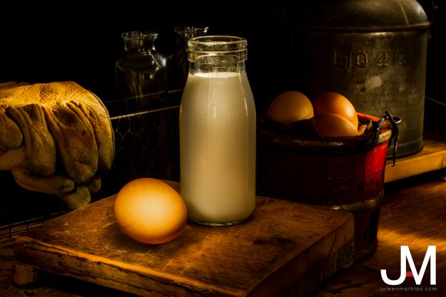
Farmhouse Morning
For this first setup, I really wanted to show off the farmhouse vibe of an early morning sunrise. With the light forming a triangle between the subject and camera, it created some beautiful mood lighting. Since the milk and eff are the main focus of this piece, it got a little bit of top lighting to bring out the highlights.
In post production, I cloned out some light trails that the camera picked up and did some dodging and burning to enhance the photo even more.
American Truck
I wanted this second setup to show the light trail in the background of the photo. I wanted it to look as if the car was in motion and leaving trails behind it. With a dim light and a diffuser, a soft light was shining on the front of the car with a quick spotlight on the baseball. This one took a few tries since the baseball is so much brighter and shinier than the rest of the photo.
In post production, I darkened the background to remove the texture of the black cloth. I felt it looked more dramatic with the pitch black background.
Pop!
In this setup, I placed different colored soda bottles on top of a piece of frosted plexiglass with an LED light underneath. By spraying the bottles with water, it created the illusion that they were chilled glasses. With another light used as a side lighting, the caps were able to be illuminated like the rest of the bottle.
In post production, I used content-aware to crop out of the photo since it was too tight. This created a larger black background.
Under the Sea
In this setup, we placed seashells on a burlap cloth with kinetic sand scattered throughout. As we used a blue and red light from either side of the setup, it created a purple light mixture. To create the illusion of water reflections, we shined a light through some iridescent plastic wrapping paper.
In post production, I altered the hues and saturation of colors.
Overall, this was a huge learning experience that helped me to become familiar with my camera settings in the dark and understand the importance of lighting.
Scanner Art and Cinemagraphs
Scanner Art and Cinemagraphs
Creative photography of scanner art and cinemagraphs.
Scanner Art
Scan art is such a unique art. Some photographers, such as Kelsey Hamilton have truly mastered the creative style of scanography. Trying to put my own spin on things, I took to the garden to pick some leaves and flowers. After a few tried of adding and taking away leaves, I finally was able to get this balanced layout. To create a black background, I covered a cookie sheet covered with a black cloth.
Since the black cloth had a bit more texture to it than I liked, I fixed it in post production. I softened the details and darkened the blacks with a selective mask to create a beautiful black background to this scan art.
Cinemagraph
Cinemagraphs are a way of combining photography and videography into one. It has become more popular for people to learn how to make their own cinemagraphs. Ready to take on the challenge for myself, I began to brainstorm some ideas I could test out.
After failing a couple of different experiments, I grabbed a cookie and a candle. To create the purple glow as side lighting, I pulled up a purple screen on my laptop at full brightness (use your resources to the fullest). The simplicity of softly blowing on the flame made for a beautiful shot.
I uploaded the video into Photoshop and cut the piece that I liked the best. By masking out only part of the video to move while leaving a still image layered on top. I created this effect that time stopped to watch this flame flicker.
Throughout creating these two images, I learned a lot in the ways of perserverence. There will be many times where I will be faced with a new challenge in the world of art. It is up to me to grow and understand the changes happening around me. After playing around a bit, I cannot wait to create some new cinemagraph and scanner art in the future.
Photography Business Branding
Photography Business Branding
Photography business branding for Juleen Mathias Photography
The Fstoppers website has an article that mentions that photography business branding can make or break your business. I completely agree that branding is where everyone places their first impressions of your company. I knew that I had to come up with a cohesive style guide that fit my brand.
I wanted to keep things looking very clean and professional. For that reason, everything is a different shade of grey, except for a pop of Candy Apple red. I chose these colors because I really believe that the combination looks very slick and professional. I designed my logo to look like my initials JAM. Although, since my business is just “Juleen Mathias Photography” and does not include my middle name, I made the “A” different than the rest of the logo.
I think through this style guide, I will be able to remain consistent for my company’s branding across all platforms so that I may be easily recognizable.
Ordinary Spot, Extraordinary Shot
Ordinary Spot, Extraordinary Shot
OS-ES is taking an ordinary location and turning it into an extraordinary shot.
OS-ES stands for “Ordinary Spot, Extraordinary Shot.” In other words, it’s taking everyday objects and turning them into something incredible through the creativity of lighting, angles and perspective.
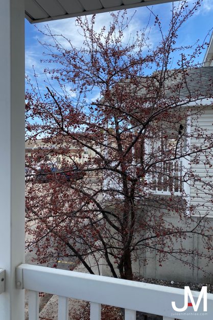
For this first shot, I had notice a lot of birds have been hanging out in the tree outside of my kitchen window. One day, I sat on my porch for about an hour just watching these birds come and go. Finally, with my telephoto lens, I was able to capture this shot. I had my settings at 1/320, f/5.6 and ISO 100. Later, I edited the shot a bit in post to really pull out the saturation in the bird while also toning down the environment around him.
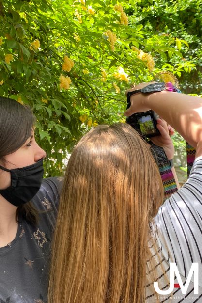
For this next shot, I really wanted to take something ordinary and get creative. I took to a greenhouse full of plants and flowers and a cheap mirror that I spray painted gold. I spotted these yellow flowers up in the tree and knew this was the spot. With a friend holding the mirror with my positioning help, we were able to create a unique setup to capture an extraordinary shot. My settings for this photo were at 1/500, f/2.8 and ISO 100.
Taking these photos really helped me to think differently when photographing different subjects. From then to now, I am constantly thinking how I can make a photo even better with different angles and thinking outside of the box.
Studio Quality Invisible Black Background
Studio Quality Invisible Black Background
SQIBB lighting to create a beautiful invisible black background in photos.
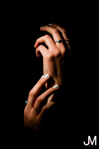
According to Glyn Dewis, there is a photography technique where you can photograph a subject in broad daylight and manipulate the camera settings to portray an invisible black background (also known as SQIBB: Studio Quality Invisible Black Background).
From the two images above, you can see that it was very bright in the area I was photographing. Despite this, I was able to use a fill flash and f/22 to create this beautiful background. I had someone hold the light at an angle to get a bit more dramatic side lighting on the hands and create some harsher shadows. The flash contained a Rogue flash bender curled into a snoot to give more of a spotlight effect.
In a room with very similar lighting as the first photo, I captured this portrait. The external flash still contained the Rogue flash bender curled into a snoot. Although, this time, it was opened a bit more to diffuse the light and not create such hard shadows on the face. I had my model sit on a chair and lean on the desk to give the effect of her resting on her hands. The light then was from a lower angle and creating a slight Rembrandt lighting effect on her face.
This final photo was taken with the baseball glove sitting on a desk. The light was angled to the right of the camera to highlight the ball in the glove, creating dark shadows on the bottom of the glove.
Overall, this style of photography is breathtaking when viewing the setup shot. It really shows how mastering your camera’s settings can make a difference in your photography.
Movie Poster
Movie Poster
Recreation of The Truman Show movie poster.
The Truman Show has always been one of my favorite movies. It’s one of those movies I can watch over and over and never get tired of it. To begin my recreation, I knew I had to take a self portrait. I took out my tripod and turned on my self timer. I rushed to a chair and took this quick headshot inside my apartment with an external flash. I then begged my roommate to allow me to take a photo of her back to act as the director. Unsplash helped me to find the perfect sky for the background.
With all my assets prepped, I took to Photoshop and Illustrator where I began molding the template of the poster. By using the original photo as a reference, I started by placing the black circles on the top and bottom. I added the photos one by one and used the reflect and transparency tools for the reflection on the ground. To create the lines on the TV screens, I created horizontal lines with a bit of Gaussian blur.
Since the chair in the photograph was not to my liking, I ended up creating a black vector shape in place of the chair.
Little by little, every asset began to look closer and closer to the original poster until I was able to create the finalized poster for The Truman Show.

